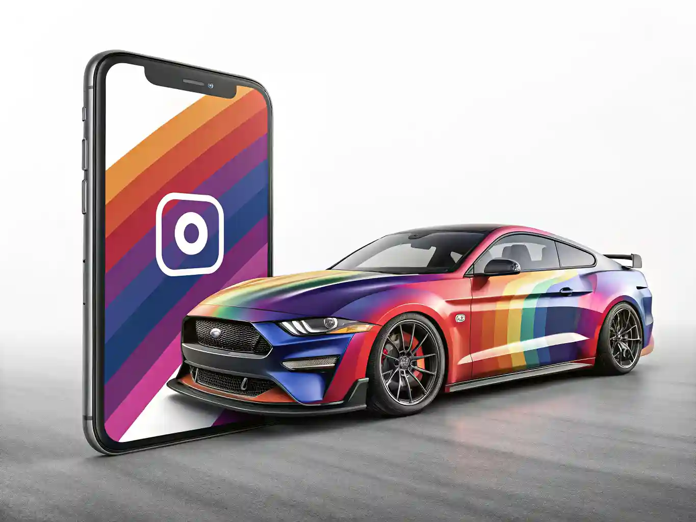
Design for Instagram and Facebook is not just about making a picture look attractive. A good social media visual has to stop the scroll, explain the message quickly, match the brand, and work naturally inside the platform where people see it. GRAFITX can make this process much easier because it gives you a ready workspace for creating posts, ads, covers, stories, and other visual formats without starting every design from a blank page.
The strongest results usually come from a balance between speed and intention. Templates help you move faster, but the design still needs a clear idea, readable text, strong composition, and the right format for the platform. Instagram often rewards clean visuals, emotional images, short messages, and a recognizable style. Facebook gives more room for announcements, community posts, event graphics, offers, page covers, and promotional visuals. When the design is built with these differences in mind, the same brand can look consistent across both platforms without looking copied or careless.
Understanding the role of each platform
Instagram and Facebook may belong to the same social media ecosystem, but users behave differently on each platform. Instagram is highly visual and fast. People scroll through images, reels, stories, and carousels with very little patience for clutter. A design for Instagram needs to communicate almost instantly. The image, color, headline, and layout should work together like one clear signal. If the main message is hidden under too much text or weak contrast, the post loses attention before the user even understands what it says.
Facebook has a broader content rhythm. People use it for local communities, events, groups, business pages, personal updates, links, and discussions. A Facebook design can carry a little more information, especially when it supports an event, service, announcement, sale, or article. That does not mean it should be overloaded. It still needs focus, but the visual can be more explanatory than an Instagram post.
GRAFITX is useful because it allows you to create visuals for different social media needs from one editing environment. You can start with a template, adjust the image, change the text, add design elements, and prepare a final graphic for publishing. The key is not to treat every template as finished work. A template is a structure. Your job is to turn it into a brand asset that feels specific, relevant, and polished.
Before opening the editor, it helps to define what the design must do. A post can introduce a product, announce a discount, promote an event, share a quote, show a testimonial, explain a tip, or support a seasonal campaign. Each goal needs a slightly different structure. A discount post should make the offer obvious. A brand awareness post can be more atmospheric. A carousel cover should make people want to swipe. A Facebook cover needs to look good on different screen sizes and should not rely on tiny details near the edges.
This preparation saves time later. Many weak social media designs fail because they try to do too much at once. One graphic should usually carry one main idea. Supporting details can appear in the caption, carousel slides, link preview, or follow-up post. GRAFITX gives you tools to build the visual, but the clarity of the message comes from your decision before the design begins.
Building a strong visual idea before editing
A strong design starts with a simple question: what should the viewer understand in the first two seconds? The answer becomes the foundation of the layout. For Instagram, this may be a bold headline, a striking product photo, a face, a short phrase, or a visual contrast. For Facebook, it may be a clear announcement, date, benefit, or call to action. When that first message is clear, all other elements become easier to arrange.
In GRAFITX, templates can help you avoid the empty-page problem. Instead of building every detail manually, you can choose a layout close to your purpose and then reshape it. A template for a sale post can become a product launch design. A flyer-style layout can become a Facebook event announcement. A clean quote design can turn into an Instagram carousel cover. The important part is to change enough of the template so it reflects your brand rather than looking generic.
Good social media design usually depends on hierarchy. The viewer should know where to look first, then second, then third. A common mistake is giving every element the same visual weight. If the headline, image, logo, price, date, button, background, and decorative shapes all fight for attention, the design becomes tiring. Strong hierarchy makes the design feel calm and confident.
A practical structure can look like this:
• Main message in the largest and clearest text.
• Supporting detail in a smaller size.
• One strong image or graphic element.
• Brand mark placed clearly but not aggressively.
• Enough empty space to let the design breathe.
• Color contrast that makes the key text easy to read.
This kind of structure works especially well for small screens. Many users will see the design on a phone, often while moving quickly through a feed. Tiny decorative text, weak color combinations, and crowded compositions become even harder to read. A simple layout is not boring when the image, typography, and spacing are handled well. It often looks more premium because it does not beg for attention.
When choosing images in GRAFITX, think about mood and function. A beautiful image is not always the right image. For a restaurant, the food should look fresh and appetizing. For a fitness brand, the image should carry movement, energy, or discipline. For a consultant, coach, or agency, the visual may need to feel trustworthy, clean, and professional. The image should support the message instead of acting as decoration.
Typography also shapes perception. Rounded fonts can feel friendly. Narrow fonts can feel modern. Serif fonts can feel editorial or elegant. Heavy uppercase text can feel loud and promotional. For Instagram and Facebook, readability matters more than font variety. Two fonts are usually enough: one for headings and one for supporting text. If the design uses too many type styles, it quickly loses cohesion.
Choosing formats and layouts that fit the feed
Format is one of the most practical decisions in social media design. A beautiful graphic can perform poorly if it is made in the wrong size or if important information is placed where the platform may crop it. Instagram feed posts, stories, reels covers, Facebook posts, and Facebook covers all behave differently. A design that looks perfect as a square may feel cramped in a vertical story or awkward as a wide cover image.
GRAFITX helps by giving you a visual workspace where you can adapt layouts for different uses. Still, it is worth thinking about the final placement before you start editing. Instagram posts often work well in square or vertical formats because they occupy more screen space in the feed. Stories and reels covers need a vertical composition with the most important elements away from interface areas. Facebook post graphics can be square or horizontal depending on the content, while cover images need a wider composition with safe space around the edges.
A useful way to plan formats is to connect each design type with its real purpose and visual behavior.
| Design type | Best use | Layout focus | Common mistake |
|---|---|---|---|
| Instagram feed post | Announcements, tips, products, quotes | Strong center, clear headline, bold image | Too much text in a small area |
| Instagram story | Limited offers, behind-the-scenes, quick updates | Vertical flow, large text, simple action | Placing key text too close to edges |
| Instagram carousel cover | Educational posts, guides, collections | Curiosity, clear topic, visual hook | Making the cover look like a final slide |
| Facebook post | Events, offers, community updates, services | Clear message with supporting detail | Treating it like a long flyer |
| Facebook cover | Brand identity, seasonal campaign, page positioning | Wide composition and balanced spacing | Placing important details where cropping may happen |
| Ad creative | Promotions, lead generation, product focus | One offer, one image, one action | Adding too many benefits at once |
This comparison shows why one universal design rarely works perfectly everywhere. A brand can keep the same colors, fonts, image style, and tone, but the composition should change according to the placement. That is the difference between simple resizing and real adaptation. Resizing only changes dimensions. Adaptation protects the message.
For Instagram, vertical space is valuable. A post that fills more of the screen has a better chance of being noticed, especially when the visual is clean and direct. Text should be short, with a strong opening line. If more explanation is needed, it can go into a carousel. The first slide works like a cover, while the following slides can expand the idea step by step.
For Facebook, context matters more. A post may appear near comments, link previews, group discussions, and shared updates. The design should be clear even when surrounded by text-heavy content. Strong contrast and a direct headline are useful. If the graphic promotes an event, the date and location should be easy to find. If it promotes a service, the benefit should be visible before the viewer reads the caption.
Customizing templates without losing brand identity
Templates are powerful because they speed up production, but they can also make brands look similar. The goal is not just to choose an attractive design. The goal is to make the template feel like it belongs to your business, page, project, or personal brand. In GRAFITX, this means adjusting colors, fonts, images, spacing, and graphic elements until the design no longer looks like a default layout.
Brand identity does not have to be complicated. Even a small business can create a consistent look by repeating a few decisions. Use the same main colors. Keep headline styles similar. Place the logo in a predictable way. Use images with a similar mood. Choose backgrounds that match the brand personality. Over time, people begin to recognize the page before they read the name.
Color is often the fastest way to create recognition. A fitness brand may use sharp contrast and energetic tones. A beauty brand may prefer soft colors and elegant spacing. A financial consultant may need calm, stable colors with clean typography. A children’s brand can use warmer and more playful combinations. The best color choice is not the one that looks trendy, but the one that supports the message and feels believable for the brand.
When customizing a template in GRAFITX, start with the biggest elements before polishing details. Replace the main image first. Change the headline. Adjust the color palette. Remove unnecessary decorations. Then work on spacing, alignment, and smaller elements. This order helps you avoid wasting time on details before the design has a clear direction.
Logos should be visible but not dominant in every post. Many beginners make the logo too large because they want the audience to remember the brand. In reality, an oversized logo can make the design look less professional. Recognition comes from the whole system: color, layout, tone, image style, and repeated visual habits. A small, clean logo placement often feels more confident.
Text also needs brand control. A restaurant may sound warm and sensory. A software product may sound direct and practical. A fashion page may use short expressive phrases. The visual design should support that voice. If the image feels elegant but the headline sounds cheap or aggressive, the post loses trust. If the typography feels corporate but the brand is playful, the design feels mismatched.
Consistency should not become monotony. A good social media feed has recognizable rules but enough variation to stay alive. You can alternate between photo-based posts, text-led posts, carousels, offers, quotes, and simple announcements. The connection should come from the brand system, not from repeating the exact same layout every time.
Designing posts that people can read and act on
Readability is one of the most underestimated parts of social media design. A post can be visually impressive and still fail if people cannot quickly read it. Instagram and Facebook are full of distractions, so the viewer should not have to work hard to understand the message. Clear text, strong contrast, simple wording, and balanced spacing make the design more useful.
In GRAFITX, pay close attention to the relationship between background and text. Light gray text on a pale image may look soft in the editor, but it can disappear on mobile screens. A busy photo behind a headline can make the words hard to read. If you want to place text over an image, use a darker overlay, a clean shape, a blurred area, or a part of the image with enough empty space.
The best social media headlines are usually short and specific. “New collection is here” is clearer than a long sentence filled with vague excitement. “Book your summer session” is stronger than “We are happy to announce our seasonal availability for clients.” People do not read social media graphics like brochures. They scan, react, and decide whether to continue.
Calls to action should also feel natural. Not every post needs a loud button. Sometimes the action is to swipe, save, comment, visit the page, book a call, read the caption, or remember the brand. If the design includes a call to action, keep it close to the message. A post about a discount can use “Shop today.” A post about an event can use “Reserve your spot.” A carousel can use “Swipe for the checklist.” The action should match the viewer’s next realistic step.
For Instagram carousels, the first slide should create interest, while the inner slides should deliver value. The final slide can invite action without feeling forced. In GRAFITX, you can keep the same visual system across all slides by repeating background style, heading placement, page numbers, and accent elements. This makes the carousel easier to follow and more professional.
For Facebook, make sure the graphic and caption work together. The image should not repeat every word from the caption. It should highlight the main idea, while the caption gives details. This makes the post easier to read and less visually crowded. If all information is squeezed into the image, the design begins to look like a poster photographed from far away.
Good design also respects attention. A viewer may see your post for less than a second before deciding whether to stop. Strong contrast, recognizable branding, and one clear idea increase the chance of that pause. Once the viewer stops, the design should reward them with useful information, emotion, or a clear next step.
Preparing final designs for publishing
The final stage is not just exporting the image. It is the moment when you check whether the design will work outside the editor. Many small problems become visible only when you imagine the post inside a real feed: text that is too small, logo too close to the edge, weak contrast, awkward cropping, or a message that feels unclear without explanation.
Before downloading or publishing a design from GRAFITX, review it at a smaller size. Zoom out or preview it as if it were on a phone. If the headline becomes hard to read, increase the size or simplify the wording. If the image loses impact, crop it more confidently. If the layout feels crowded, remove one element rather than shrinking everything.
File quality also matters. Social media platforms compress images, so the original design should be clean and sharp. Avoid using low-resolution photos, stretched logos, or tiny icons that become blurry after upload. If the design includes a product image, make sure it looks crisp. If it includes text, check that the letters remain clean around the edges.
A useful publishing workflow includes a final quality check before each post goes live. Look for spelling mistakes, inconsistent capitalization, wrong dates, old prices, broken visual balance, and missing brand details. These errors may seem small, but they affect trust. A polished post suggests that the brand is careful. A careless graphic can make even a good offer look unreliable.
It is also smart to build a small library of reusable layouts in GRAFITX. Once you create a strong Instagram quote post, product announcement, Facebook event graphic, carousel cover, or sale design, keep it as a base for future posts. This saves time and protects consistency. The goal is not to design from zero every day, but to create a system that can produce good visuals quickly.
Testing is part of the process. Some designs may look beautiful but receive little response. Others may be simple and perform better because the message is clearer. Watch how people react to different formats. Save posts that get strong engagement. Compare image-led designs with text-led designs. Notice whether your audience responds better to bright colors, calm layouts, human faces, product close-ups, or educational carousels.
Over time, your social media design becomes less random. GRAFITX gives you the tools to create, but your results improve when you understand what your audience notices, reads, saves, and clicks. The best design system is not the most complicated one. It is the one you can use consistently while still keeping the content fresh.
Conclusion
Creating designs for Instagram and Facebook in GRAFITX becomes much easier when the process has a clear structure. Start with the purpose of the post, choose the right format, build a strong visual hierarchy, customize the template for your brand, and check readability before publishing. The design should look good, but it also has to work: people should understand it quickly, trust the message, and know what to do next.
Templates, images, fonts, and colors are only parts of the result. The real quality comes from how these parts are combined. A clean Instagram post can make a brand feel modern and memorable. A clear Facebook graphic can support an event, offer, or service without overwhelming the viewer. When every design has one main idea and a consistent visual language, social media content starts to look more professional and more recognizable.
GRAFITX is especially useful for creators, small businesses, marketers, and page owners who need attractive social media visuals without a complicated design workflow. With thoughtful editing and a strong sense of purpose, it can help turn simple templates into polished graphics that feel personal, practical, and ready for real audiences.